HP TouchPad Review
 By: Kris Keilhack
August 1, 2011
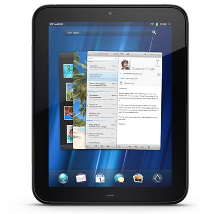
HP's TouchPad is not only the first ever non-smartphone WebOS device, but also the first non-phone "Palm" device since 2005's TX and Z22. As such, ever since its February unveiling, the combined HP/Palm entity is placing a tremendous amount of faith that the the TouchPad will spearhead a rebirth of WebOS, now debuting in verion 3.0 form on this device. Read on for my in-depth TouchPad review.
Packaging & Box Contents
Since the TouchPad represents so many "first" for HP's Palm Global Business Unit, it's no surprise that the packaging has received a complete overhaul. Gone is the rectangular rigid cardboard box that Palm used for every device from 2008's Treo Pro through the recent HP Veer.
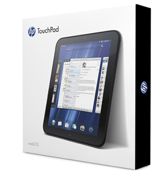
Instead, the TouchPad comes neatly packaged in an Apple-esque sturdy white cardboard sleeve with an all-black interior box. The nicely finished black interior tray is separated into several compartments containing the TouchPad itself, the microUSB cord, and a elongated version of the cylindrical Palm-style AC adapter that has finally had its "Palm" branding removed. A central interior compartment contains a smattering of printed material such as a getting started guide and a microfiber cleaning cloth.
I was somewhat disappointed to see nothing in the way of a sleeve or carrying pouch included in the box. Given the TouchPad's propensity for picking up fingerprints and smudges at an alarming rate, this would have been a much-appreciated freebie. Thankfully, the aforementioned black microfiber cleaning cloth is included along with two separate pieces useful of printed documentation. These are small but nice touches and very appreciated, especially considering that this will be the first tablet experience for many TouchPad owners.
Bargain hunting WebOS fans should note that as of this writing, Costco is bundling the 32Gb TouchPad with a black neoprene case for $20 less than the usual $599.99 MSRP, making that a solid deal for users looking for a case as part of the package.
Build Quality & Aesthetics
Subpar build quality has been an enormous thorn in the side of all Palm-branded WebOS devices. With the final Palm-branded effort, the Pre 2, we saw some encouraging signs of improvement. This road to recovery was solidified with the recent Veer 4G and now appears to be a done deal with the arrival of the TouchPad.
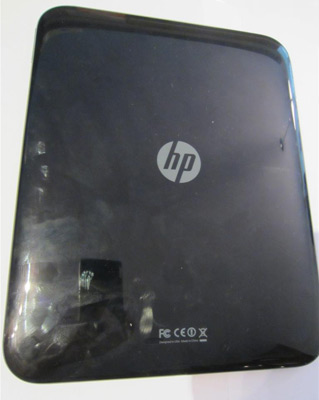
Taking the TouchPad out of the box was like picking up the bastard offspring between a first-generation iPad and a Treo Pro that had received an extra-thick coat of gloss. This thing is slick in both appearance and handling. In these hot midsummer months, holding the TouchPad with a sweaty hand feels almost like an accident waiting to happen! Aside from the low-cost Centro and Zire, nearly every prior Palm product over the past decade has had had a metallic body or generous assortment of soft-touch paint applied to the exterior, so this slippery finish comes as something of a surprise. No matter what, I could not stop thinking of the design similarities between the TouchPad and the seldom-seen Treo Pro of 2008. The TouchPad certainly looks sleek, but like the Treo Pro of years ago, it's not a practical finish for a mobile, handheld device. Indeed, multiple throughout my testing period I kept thinking that the sleek exterior would be far more appropriate for a stationary device like a flat-panel HDTV or a game console than for a handheld device.
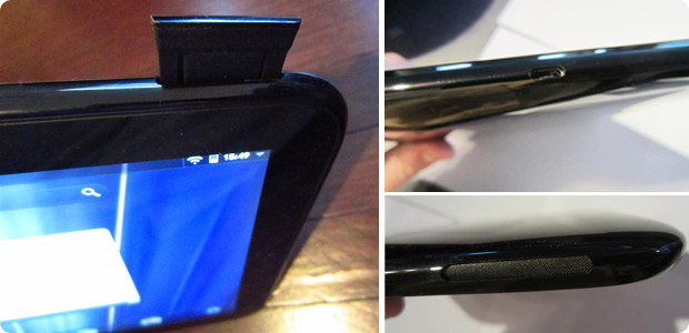
Continuing around the exterior of the device, the TouchPad is thankfully devoid of any garish logos or unsightly gaps between body panels. The four physical buttons (power, volume up/down, home) are all small but nicely defined and respond with a satisfying "click" when depressed. Speaking of physical buttons, the return of the center button deserves mention, as it has been absent in every WebOS device released since the original Pre. It is still illuminated with a softly glowing white LED and has a nice tactile response, but it would be nice if the button were a bit larger and recessed (ala Apple) or raised (ala Pre). As many post-Pre users have remarked, having a well-defined click button helps the user to properly orient the device, though the front-facing camera does help a bit in this regard. The bottom-mounted microUSB sync and charge port is slightly recessed but only enough to offer a bit of protection and certainly not enough to impede with cable insertion.
There were no creaks, groans, or wobbles anywhere on the TouchPad. Thankfully, Corning's ultra-tough Gorilla Glass continues its string of appearances from the Pre2 and Veer and is in full effect on the TouchPad. My only complaint with the TouchPad's build is that the outer rim of the speaker ports were a bit on the sharp side, particularly when held in portrait mode or gripped tightly while carrying the device. While it's nothing that would interfere with daily operation like the sharp lip on the keyboard slider of the Pre family and, to a lesser extent, the Veer, this is still a disappointing and very cheap-looking flaw on an otherwise solidly-built device.
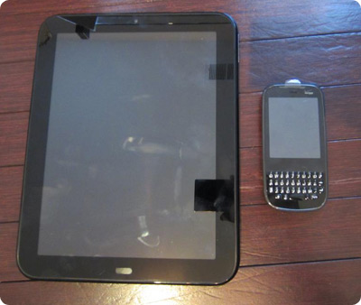 While I have only been using the TouchPad for testing around the house for a few weeks, the device's finish unfortunately appears destined to not wear well over the long haul. I have been handling this review device with kid gloves and the glossy back has already picked up a number of faint scratches just from being placed down on a desk or countertop . While the TouchPad's build quality and materials are certainly not up to the standard of Apple's devices or even in the upper echelon of Android-based tablets like the Samsung Galaxy Tab line, it's a very solid, very well-built piece aside from the aforementioned glossy plastic. Again, this is a matter of material choice and finish and not with the device's actual construction or assembly.
If HP intends to continue the bulky, all-plastic TouchPad designs, then as evidenced by the recent iSuppli teardown, the TouchPad needs to become a more cost-competitive device befitting its size and construction. Ideally, a dose of soft-touch finish or a bit of textured aluminum or similar material in the second iteration of TouchPad would do wonders for the appearance and durability of the device. This issue of cost of materials may become especially significant if HP intends to keep the various TouchPad SKUs priced identically to those from Apple (and above Samsung's tablets).
Formfactor
As I stated previously, this tablet is almost exactly the same as a first-generation iPad in every dimension, outweighing that device by a few ounces. While I think 16:9 and 16:10 aspect ratios are delightful for LCD monitors, televisions, and smartphones, I truly feel that 4:3 tablets in the 9" category are by far the most comfortable and practical to use in both landscape and portrait modes, especially for extended usage. I still maintain that the ideal tablet formfactor is somewhere larger than 7" but smaller than 9.7" (such as the 8.9" offerings currently available from LG and forthcoming from Samsung). With the continued absence of Android Honeycomb and iOS from the 7" sector, I will be very curious to see how the upcoming 7" TouchPad variant fares against legacy Android Gingerbread offerings and RIM's potentially doomed Playbook.
Despite its 4:3 screen orientation, as nice as the TouchPad's aesthetics are, it simply isn't very comfortable to hold for extended periods of time. This is due to the combined bugaboos of weight, slipperiness, and thickness. Comparing the TouchPad to the two Android-based tablets I have yields some interesting results. The Samsung Galaxy Tab 7 has an all-plastic construction similar to the TouchPad, albeit with a superbly textured backside that affords the user a comfortable, secure grip at all times. My Acer Iconia A500, in contrast, weighs the same as the TouchPad and is much more unwieldy to use in portrait mode due to its large 10.1" 1280x800 16:9 LCD. However, the Acer has a nice brushed aluminum back that is easy to grip and is cool to the touch and also packs a plethora of expansion ports and slots (HDMI, fullsize USB, microSDHC) that the TouchPad lacks. Once again, both HP and the various Android licensees can stand to learn much from Apple and Samsung.
While we are on the subject of expandability and connectivity, given the added bulk of the TouchPad's case, I find it appalling that HP could not have seen fit to cram in one or two bonus features in order to differentiate the TouchPad from the iPad. When a company such as HP fields a >$500 item in the most competitive new market segment in years, there's a difference between having "zen" and simply being feature-deficient. With the cloud-centric, PC-free paradigm established by WebOS, it's even more mind-boggling that the TouchPad is so utterly unable to function as a stand-alone mobile media device. Whether a removable battery (previously a "Palm" smartphone trait), HDMI output, USB host port or a removable expansion card slot, many of the criticisms leveled at both WebOS and the first-generation TouchPad could have been mitigated with one or two new hardware features that have been standard on other platforms for years (Android) or at least available via add-on connectors (iOS). The arrival of a 64GB TouchPad (with a higher-clocked 1.5Ghz CPU to boot) in the coming months will give more space to power users, but with 32Gb microSDHC cards ringing in below $40 and 64Gb SDXC fullsize cards hovering around $100, installing a bigger card will always a more cost-efficient proposition than having to buy a completely new tablet, even if the slot is dedicated to media storage only.
Weight and size criticisms aside, the TouchPad is a very pleasant device to look it, at least initially. It has similarly sleek curves and gentle contours as its older WebOS siblings but does not look like an enlarged Pre by any means. Like the Veer before it, the TouchPad has no flimsy port doors or port covers.
From the retail displays I have seen thus far, the TouchPad certainly holds its own in the appearance department compared to its competitors on store shelves. Only its chunkiness suggests that the OS contained within may be less cutting-edge than its competitors, as HP's looping demos do a great job of pushing the TouchPad's apparent strengths compared to its key competitors.
MicroUSB & Battery
While my biggest complaint with the Veer's design was the proprietary nature of its magnetic sync/charge/audio port, I am glad to say that the TouchPad has managed to trump nearly every other tablet on the market with its brilliant decision to use a conventional microUSB port for charging. Add to that the still-brilliant Touchstone dock concept and its integrated functionality into the Touchstone and you have quite a nice combo. As a result, I feel this merits its own section in this review.
Apple's iOS devices have long used a proprietary connector but the Android tablet world remains horrible fragmented for sync and charge connectivity. Some devices such as the Toshiba Thrive have enormous laptop-sized AC adapters. Some such as the Motorola Xoom use what appear to be oversized cell phone chargers with fragile connectors. Others such as Asus' EEE Pad Transformer and Samsung's Galaxy Tab series, use proprietary latching connectors that look similar to but are not compatible with Apple's connector.
HP has thankfully done away with all of this tomfoolery and put a simple microUSB port on the bottom of the TouchPad for both charging and local synchronization purposes, just like the vast majority of smartphones on the market. I tested the TouchPad with two Motorola microUSB AC adapters and an older Blackberry Bold charger. While I received a "May not charge" notice on the TouchPad's status bar and the battery icon did not indicate that it was actively charging, I was thrilled to see that the TouchPad did indeed charge fairly rapidly while the screen was off. It was not as fast as using the provided HP rapid -rate charger but it was certainly sufficient to top off the device when I had a spare hour or so to set it aside to charge. Even better, I was successfully able to trickle charge over a USB 2.0 connection to my PC (via a generic microUSB cord). I placed the TouchPad in airplane mode and turned off the screen and hoped for the best. Amazingly, the battery began creeping upwards at a rate of approximately 1% every nine minutes, though trying to use the device while plugged in would continue to drain the battery, even with Wi-Fi off. Regardless, this is a major positive mark for HP's engineers.
For frequent travelers who must pack light, this could be a mission-critical feature. I could conceivably leave on a trip right now and bring my smartphone, my Bluetooth headset, and a TouchPad, keeping all of those devices charged via a single microUSB wall charger. I find it terribly ironic that HP's decision to use a proprietary charger spells doom for the Veer but having industry-standard microUSB on the TouchPad released less than two months later is a stroke of genius. Sticking with a sensible, industry-standard connector ensures that users will be able to find affordable, compatible chargers and cables anywhere in the world. I have handled nearly every current tablet on the market and I cannot stress what a huge plus this is for the TouchPad. Off the top of my head, only the HTC Flyer/Evo View, BlackBerry Playbook, and Barnes & Noble's Nook Color tablet/reader hybrid can be charged via microUSB. As of this writing, the TouchPad is the only tablet with a screen size larger than 7" that charges over microUSB. The upcoming TouchPad 4G will also be the only >7" tablet on the market with both integrated WWAN and standard microUSB charging. High-fives all around to HP's engineers for this move.
 I was really hoping that in its transition from smartphone platform to Wi-Fi tablet running WebOS 3.0, HP could have reconfigured the TouchPad's USB Mass Storage mode to permit device functionality while in usage as a drive on a computer. Alas, this is not the case and unlike Android-based devices, the TouchPad is just like older WebOS hardware in being rendered completely functionless while in drive mode. Also, my TouchPad had the annoying tendency to not come out of USB mode even after ejecting the drive in Windows. Returning to the WebOS UI required removing the USB cable from the TouchPad in such situations. This is a minor nuisance when trying to trickle charge over USB after USB drive operations are completed and something that needs to be addressed ASAP in a future update.
While I have not made any detailed battery life measurements, battery time, especially on standby, is quite impressive. This is no doubt due to the sizable 6,300mAh battery packed inside. WebOS appears to finally be reaching a fairly mature state when it comes to power management, thankfully.
After giving the TouchPad a full charge overnight, on my first day of TouchPad usage I had nearly three hours of sporadic testing with Bluetooth off but Wi-Fi on. During this time my activities consisted mostly of Angry Birds gameplay, App Catalog downloads, reading the entirety of HP's Pivot magazine, 30 minutes of web browsing, and several YouTube music videos at maximum volume, with the screen set to 3/4 brightness, I still had approximately 83% of my battery remaining. That is quite impressive. Standby times are equally superb, with the TouchPad holding steady at 48% of battery life and sitting on my nightstand for over 48 hours and connected via wi-fi and receiving emails. Similar circumstances would cause my Acer Iconia to be depleted or approaching zero in the same amount of time.
One minor software-related aspect of WebOS 3.0 that I appreciated was the ability to toggle Wi-Fi or Bluetooth on from within Airplane mode. I imagine this feature will be particularly handy for TouchPad 4G users trying to maximize their battery life while maintaining a minimum of connectivity.
Camera & Speakers
One of the most mystifying design choices on the TouchPad is its lack of a rear-facing camera. While it is no secret that vast majority of tablet cameras fall far short of their smartphone siblings, an integrated camera is always a handy thing to have. The complete lack of even a VGA rear camera on the TouchPad limits its functionality compared to every other tablet on the market. WebOS has supported image capture since the launch of the original Pre, so I find the lack of a "primary" camera an inexcusable omission. With the extra breathing room afforded by the roomy TouchPad chassis and WebOS 3.0, this would have been an ideal opportunity to introduce autofocus camera capabilities to the WebOS line.
The sole camera present on the TouchPad is a front-facing 1.3mp model. I was again stunned to find no native image capture application whatsoever. Even a totally barebones image capture application tied to the front camera would have been better than nothing!
On a brighter note, the TP's integrated speakers surpass anything else in the category. I previously considered the Dr.Dre-endorsed Beats audio technology from HP nothing more than Monster Cable-style marketing propaganda but I have to admit that they are quite impressive, especially at moderate volume levels. The way that the speakers are oriented (both are on the left panel of the device when it's in portrait mode) means that the optimal sound quality is achieved when the device is held in landscape mode or placed on a surface.
The 3.5mm stereo headphone jack is not recessed and does not wobble or crackle excessively when the plug is moved. Audio output through the 3.5mm jack to a pair of Shure E2C earbuds was rich and static-free superb. The audio experience of many tablets is usually relegated to second or third-tier status, so it's very encouraging to see HP paying particular attention to this facet of the TouchPad's design. The audio output of the TouchPad's internal speakers absolutely blew away the sound provided by my Android tablets.
Screen
HP simply played it safe with their screen specifications and outfitted the TouchPad with a very similar LG IPS LCD to the one found on the iPad 1 & 2. The reduced number of pixels compared to the current crop of Android tablets isn't anything worth worrying about, though there are noticeable jaggies in Angry Birds and Robotek compared to the Android Honeycomb versions that run at a higher resolution. As always, Apple looks certain to crank up the pixel density in the next iteration of iPad so HP cannot rest on their XGA laurels for long, despite the TouchPad being the first WebOS device to break the 320x480 resolution barrier.
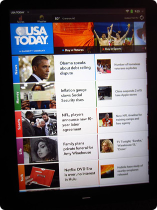 I unfortunately do not have an iPad to do a side-by-side comparison, but despite a few shortcomings, the IPS screen that HP selected is definitely a safe and superior choice compared to some of the lesser TFT screens on the market. That said, the TouchPad's screen looked a bit washed-out at times. Colors on the TouchPad do not have the same "pop" that they have on the much lower resolution Veer screen or on the similarly-sized iPad screens. Black levels, in particular, were less than spectacular. Thankfully, the TouchPad's LCD has a very neutral color balance and no blue or yellowish tint was noticeable. Viewing angles are absolutely spectacular, as is expected of an IPS display.
I noticed no ghosting or backlight bleed on the TouchPad's screen. One quibble is that the backlight, even when cranked to maximum, falls far short of the retina-searing brightness of some other tablets, particularly the iPad 2. Additionally, the auto-backlight feature errs on the conservative side, often requiring manual intervention for a slight brightness boost to comfortable levels. Performance outdoors does suffer drastically but that is understandable and not a major usage scenario for most tablet users.
I feel compelled to get down on my knees and thank the Gods of Sunnyvale that the onerous WebOS gesture area has finally been banished to same area of Hades that claimed the silkscreened Palm OS Graffiti area almost a decade ago. I was never a fan of the unintuitive gestures and their accompanying screen real estate-gobbling area on earlier Palm WebOS devices, so I wish a speedy departure to the gesture area and the legacy Mojo framework as relics of the past. In fact, WebOS 3.0 has survived the removal of the gesture area quite nicely and I'll discuss this more in the software-oriented parts of this review.
While the TouchPad is the most landscape orientation-friendly WebOS device yet, it still feels "best" in in portrait mode, much like iOS. Nevertheless, landscape-oriented activities such as web browsing, video watching or playing Angry Birds become incredibly more satisfying without having to deal with an exposed keyboard (Pixi) or an accidentally-exposed keyboard slider (Pre, Veer) offering interference. The fiddly accelerometer and I had a difference of opinion in this matter, which I will also discuss later.
Wireless Connectivity
Being a grizzled veteran of the "Dear Palm, please give us integrated Wi-Fi!" years, I am glad to report that 802.11B/G is standard on the TouchPad, as is Bluetooth 2.1 + EDR. Wi-Fi range was good but not spectacular. Compared to my Acer A500 tablet, the TouchPad's wireless signal strength to a 2Wire router and Netgear range extender was a bit weaker, though it was far superior to either my Droid X2 or the Veer and a slight bit better than the Samsung Galaxy Tab 7.
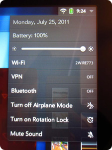 Sadly, HP mimicked Apple once again in omitting a GPS chipset from the Wi-Fi version of their tablet. Only the upcoming HSPA+ TouchPad 4G will have an integrated GPS receiver. While this is familiar territory for iOS fans, Android users have grown accustomed to full GPS capabilities in all but the lowest-end tablets on that platform.
I did not bother testing the Bluetooth capabilities on the TouchPad, as I lack a compatible WebOS phone and I recently crushed my Motorola Bluetooth stereo headphones. For most users' needs, Wi-Fi is a far more critical component of the tablet experience than Bluetooth.
Miscellaneous Specs
Out of the box, the TouchPad is running HP WebOS 3.0.0 on hardware version "A". Out of the 32GB of internal storage present, a bit under 30GB remains available immediately for user storage out of the box.
OS & UI
Relatively minor hardware differences aside, the biggest differentiating factor of the TouchPad compared to every other tablet on the market is that it runs WebOS and is not an iOS or Android-based device.
When we first saw version 1.0 of WebOS way back at HYPERLINK CES 2009, the OS seemed markedly ahead of what was available on every other current smartphone platform, not to light-years ahead of the antiquated Palm OS Garnet. However, since the Pre's debut, both iOS and Android have garnered tremendous amounts of new users while receiving drastic improvements on their way to becoming more cloud and tablet-friendly. WebOS, in contrast, stagnated shortly after launch due to Palm's financial difficulties, with last year'ss acquisition of Palm by HP adding to the misses product cycles. Only now is WebOS reaching 3.0 form, with many users (myself included) feeling that this is the first version of the OS that is truly ready for primetime. However, much work still remains to be done as the OS transitions from the legacy Mojo to the new Enyo framework that will enable HP to extend WebOS to devices such as printers and PCs and grow well past its smartphone roots.
Back to the TouchPad and what's new in WebOS 3.0 : Gone are the four quicklaunch icons from WebOS 1.x and in their place are five user-assignable shortcuts. The seldom-used (at least for me personally on my Pixi) "wave" gesture has also wisely been banished along with the gesture area. In fact, the only "gesture area" gesture remaining is a swipe up from the lower bezel to the screen to shrink an app back to card view or to raise and lower the launcher. However, I found it faster and more intuitive to just hit the physical home button to exit fullscreen mode. When in card view, tapping the home button alternates between card view and a fullscreen view of the four categories of the app launcher mode instead of bringing the main card to the forefront. Additionally, some apps such as Angry Birds do not support the up swipe gesture and require a press of the home button to minimize.
As I mentioned earlier, the entire OS is now much more landscape-mode friendly, since the physical limitations imposed by a fixed or sliding portrait smartphone QWERTY keyboard are now long gone. The omnipresent menu bars is always at the top of the screen no matter the orientation and the notification alerts are now repositioned to the top right corner instead of gobbling up precious screen real estate at the bottom. In fact, the top-right corner has become a very welcome frequent destination for WebOS 3.0 users, as it contains a handful of new functions such as "Rotation Lock", "Mute" "VPN" and a screen brightness slider. While some Android OEMs such as Samsung have implemented these toggles into their proprietary UI skins, most of these sorts of adjustments are toggled via various user-added widgets in Android. It's nice to have a single, unified destination for things like brightness or screen lock in the stock OS implementation.
Since gestures have been banished, we now have intuitive "back" buttons in the lower left corner in place of the left-swipe gesture. Some onscreen elements of the WebOS UI such as the top-left drop down App settings menu and some settings screens do appear like they have not been fully optimized for the larger screen and resolution, and just hastily upscaled from the 320x480 days. I am sure that HP will continue to tweak and refine this in the future.

Notifications & Multitasking
WebOS still is best-in-class at handling notifications in a discreet, unobtrusive manner. Multiple notifications result in a simple stack that can be addressed immediately or ignored until later. I'd put its notification system slightly superior to the latest versions of Android (2.3.4 and 3.2) and definitely above what is found in iOS 4.x, though Apple is set to overhaul notifications and alerts with the pending release of iOS 5.
My single favorite element of WebOS since CES '09 has been the card "throw away" upward flick. Ever since CES 2009 I have dreamed about how well the WebOS UI would scale to a larger screen, so I'm glad to say that it's indeed more fun to do on a device with a larger screen than the Pre. Newer additions such as stacks also far better on a larger-screen device such as the TouchPad than during my first encounter with them on the diminutive Veer. Again, it's not just screen real estate and pixel count; multitasking and moving between cards on a device with the CPU and RAM capacity to have dozens of simultaneously running tasks is a huge improvement.
Despite the ups and downs of Palm and the ecosystem over the past few years, WebOS' card metaphor remains the paradigm of mobile device multitasking. The ability to shuffle between multiple applications and the addition of stacks only improves the user's efficiency, at least on devices with screens larger than found on all legacy WebOS smartphones. Compared to the much newer Android Honeycomb's task switcher, WebOS still feels fresh and fluid when juggling multiple tasks. Apple's iPad may have a built-in audience due to that device emulating the iPhone user experience, but I still feel that of the big three tablet OSes, WebOS is still the most finger-friendly and efficient, at least for basic navigation and UI tasks, though Android Honeycomb in improving rapidly due to the unmistakable efforts of ex-Palm UI guru Matias Duarte, especially in its handling of alerts and notifications.
OnScreen Keyboard
Not only is the TouchPad the first non-phone Palm device since 2005, it's the first one since the TX and Z22 to sport a virtual onscreen keyboard. One of the most pleasant surprises on the TouchPad was the quality of its onscreen keyboard. I went into the TouchPad experience with very low expectations but I am glad to say that HP has pulled off a delightful typing experience.
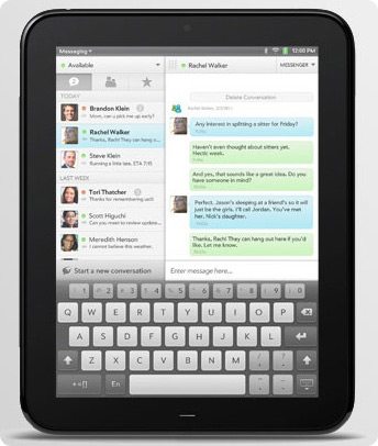 The biggest and most noticeable addition is a 5th row at the top of dedicated number keys. Why this continues to elude Google and Apple on their stock tablet keyboard I will never understand. Thankfully, HP and the Palm GBU have made a very common-sense addition to the device. Another nice keyboard-related touch is the ability to toggle between four different keyboard sizes. I am a big keyboard tinkerer on Android and regularly toggle between various keyboards: stock, Swype, SwiftKey, and Graffiti, just to name a few, so the ability to resize the TouchPad's keyboard on a whim is a nice touch. This is especially beneficial when using the device in portrait mode and trying to type with some semblance of speed with both thumbs.
My only criticism of the TouchPad's onscreen keyboard is the lack of haptic feedback, a feature I consider mission-critical for typing on any all-touchscreen device. Both of my Android tablets have it and all of my Android smartphones have had it. I am sure this will be added down the road, either officially via ROM update or a user community-generated patch. Also, some directional arrows on the keyboard (even on a secondary screen) would be immensely helpful with navigating and editing text (assuming we eventually have the capability of editing documents in WebOS!). This is a complaint I have at nearly every current tablet, as frequent fingertip tapping becomes tiresome and can never equal the precision of a stylus, trackball, d-pad or arrow keys.
Also, now that the Palm legacy is fading into the past, is it too much to ask for Access to license Graffiti back to HP or at least release an app to let us do Graffiti strokes on the big screen? The irony of Graffiti being available on Android but not the homegrown WebOS never ceases to amaze me. Finally, it would be nice to eventually see HP make a strong push into adoption voice input and dictation capabilities into WebOS.
Performance
I don't know of any other term to summarize the TouchPad's overall performance other than "disappointing". In fact, it's extremely disheartening to see a device with a relatively low pixel count and such powerful innards continually grind to a halt while in use. For a device with a dual-core Qualcomm Snapdragon 1.2Ghz CPU, relatively powerful Adreno 220 GPU and 1Gb of DDR2 RAM, the TouchPad often feels quite Pixi-like with its sluggish performance. Less powerful Apple hardware (namely the first-generation single-core iPad with 256MB RAM) run circles around the TouchPad, and it simply collapses in direct comparison between the dual-core iPad2 and the various Tegra2-based Honeycomb Android tablets.
If there is a silver lining in this disappointing performance, it's that all TouchPad models are still packing powerful hardware that is growing more powerful with each iteration, as evidenced by the recently-leaked roadmap showing a 64GB version with a 1.5Ghz CPU shared with the TouchPad 4G. As HP officials have stated numerous times, lack of OS optimization (instead of underpowered hardware) is by far the primary culprit for such poor performance. However, it is a bit disconcerting that any device with such a beefy Qualcomm SoC cannot plow through the most basic of tasks with brute strength alone.
As of this writing, the TouchPad has not received a single OS update or improvement. I expect the forthcoming WebOS 3.0.2 update to drastically improve upon the device's overall performance once things like hardware video acceleration is added to the OS. However, this is a review of the TouchPad in its initial state of retail availability and, as such, it must be stated that the device's overall performance is simply unacceptable. These performance issues are especially troubling for a device whose most common SKU is $599 and is competing in the very upper echelon of the tablet sector.
The TouchPad's performance can alternate between being mystifyingly decent one moment and utterly abysmal the next. I saw traces of this inconsistent performance during my time with the Veer but nothing this pronounced. When in the midst of an active application, things generally perform quite well and on par with a Tegra2-based Honeycomb tablet or iPad, even for gaming. However, the TouchPad's performance shortcomings rear their head when switching or launching apps and executing basic OS functions. Most of the time it makes no difference if the TouchPad is running a single web browser card or maxed out with several dozen open programs. I observed hiccups and pauses well upwards of twelve seconds, with the entire unit frozen and unresponsive to any form of input. All too often I would be in the midst of launching an app or switching from fullscreen to card view and the TouchPad would lock up for ten seconds or more before zooming back to life and forcing me to deal with a furious cavalcade of swipes, taps, gestures, and home button clicks (all done by me during the extended pause in an effort to make the OS respond). Also, despite the presence of a Gorilla Glass screen, the screen can be very unresponsive at times to touch input, despite the presence of the little ripple effect that indicates a registered tap. The TouchPad's accelerometer also is wildly inconsistent, preferring to stay in landscape mode versus portrait mode. This is supposedly on the list of fixed items for the 3.0.2 update.
Boot-up times are particularly painful, as I clocked a 72-second startup on a freshly-wiped TouchPad and a 76-second startup with an average load of apps and files onboard. Shut-down times fare far better at approximately 14 seconds.
Web Browser
Perhaps most distressingly is the slow loading of web pages with the stock TouchPad browser. I initially had high hopes for the browser, which superficially most closely resembles Apple's mobile Safari browser.
Immediately, I noticed surprisingly slow page renderings speeds with the TouchPad browser, so I ran a series of page load tests between my Acer Iconia and the TouchPad. Both had fully-charged batteries, no background tasks running, and were connected to the same Netgear wireless access point. Time after time, the TouchPad took far longer to render both desktop and mobile-formatted sites than the Acer. For some complex, graphics-heavy sites such as Foxnews.com or the wallstreetjournal.com, the differences between the two devices in fully loading the page ranged from fifteen to nearly twenty seconds. Loading palminfocenter.com three times in a row resulted in an average difference of 14 seconds between when the Aver fully loaded the page and when the TouchPad finished loading. Even the feeble little Pixi Plus loaded palminfocenter.com in its entirety a few seconds faster than the TouchPad. While the TouchPad was almost always able to navigate through the partially-loaded pages, it was annoying to see this delay attributed to my device and not my connection speed.
After using the device for a few days, I began to notice occasionally incorrect formatting and glitches such as overlapping text or non-functional pulldown boxes. Testing the stock browser for compatibility on the Acid3 test resulted in a 92/100 score for the TouchPad, compared to a 100/100 score on the Acer Iconia running Honeycomb 3.1 and 93/100 on both my Droid X2 and Galaxy Tab 7 running Gingerbread 2.3.3. The TouchPad also took nearly twice as long to complete the Acid3 test as the other devices.
For a platform currently bereft of any standout native applications, having a world-class web browser is critical. The TouchPad's WebKit-based browser has a solid foundation but is still in need of some major performance and feature enhancement tweaks. Another missing feature is the ability to go fullscreen with the browser and maximize every available pixel when browsing desktop-formatted sites. The stock web browser does not have tabbed browsing but instead will launch new sites in their own cards. That is a fine feature in general but the delays in launching new cards and navigating between them quickly becomes tiresome. More often than not, I just browsed a single site at a time on the TouchPad, whereas on my Android devices, I use the physical volume keys to flip between a half-dozen or more active tabs.
Love it or hate it, Adobe's Flash technology is still an important factor for many mobile web users, especially for viewing video content. The good news is that the TouchPad has a solid Flash implementation in its web browser out of the box. Unfortunately, its performance again comes up short. Still, it's available out of the box and generally performs sufficiently.
Apps
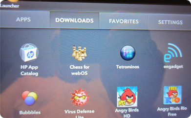 It's no great secret that the WebOS App Catalog is quite barren for HP's smartphone users. The number of tablet-optimized applications is even tinier. Even while HP trumpets their "quality over quantity" stance , the absence of native WebOS clients for such mobile staples as Gmail, YouTube, Netflix, Hulu, Pandora and similar favorites will be quite shocking for users used to the bevvy of apps optimized for Android and iOS. The native functionality of the TouchPad's email app handles Gmail quite well, and the integration of Flash in the web browser makes for reasonable YouTube (as well as, surprisingly, Hulu) content. Still, browser-based workarounds cannot come close to addressing the major Achilles heel in the WebOS market, so many users may try to use upscaled legacy WebOS smartphone apps as a stopgap solution on their TouchPads.
While some legacy PDK-based WebOS games display in fullscreen, the transition from320x480 to 1024x768 leaves much to be desired, both from a reliability and an aesthetic standpoint. With the imminent launch of the transitional Pre 3, HP is encouraging app developers to include low-resolution and high-resolution art assets for upscaled apps whenever possible but those apps currently appear to be few and far between. Most legacy Mojo WebOS apps I tried are emulated in a smallish window ( a "virtual Pre", if you will). and were unsatisfying to use, to put it very politely. iOS remains the king of backwards compatibility.
Whenever possible, I tried to assess the TouchPad's capabilities using the scant assortment of native tablet applications. A handful of TouchPad-specific applications such as USAToday's news app, are absolutely phenomenal and are truly showcases for the platform. HP's Pivot e-magazine also looks great and is a fantastic way of introducing users to the platform and showcasing new apps. Additionally, HP's homegrown Facebook app is so astonishingly better than every other mobile version of the app that it takes the cake as the definite mobile Facebook experience. If only HP could apply their "special sauce" and whip up a few thousand more native WebOS apps with the level of polish of this one!
Documents & Productivity
On a more distressing note, the lack of a full-featured document editing app such as Documents To Go, QuickOffice or Polaris Office is an enormous blow to the TouchPad's appeal with students and mobile professionals. While the inclusion of the read-only version of QuickOffice is certainly appreciated, the inability to create or edit documents on WebOS devices has plagued the platform for years and is simply an inexcusable absence at this point in time, especially given HP's considerable financial resources and industry clout.
Online solutions such as Google Documents do work to an extent, but offline capability is still a necessity feature. As a long-time Palm OS user who edited and created Office documents with Documents to Go as far back as 2000 on a Palm V, I would never give WebOS any serious consideration for any type of device as long it inexplicably lacks such as rudimentary, mission-critical feature. This is especially disconcerting given HP's strength in the education and business PC world and numerous comments made over the past year by Rubinstein, Bradley, and others about gunning for enterprise customers with a line of WebOS products.
I feel that during the genesis of the TouchPad and WebOS 3.0, HP focused on too many sideshow-type novelty features such as Touch-to-Share, Exhibition Mode and the phone-to-tablet aspects of Synergy instead of taking efforts to shore up the device's capabilities as an actual productivity device. Touch-to-Share, for example, would be a far more useful function if it had cross-platform compatibility between WebOS, Android, and iOS smartphones with "bump"-type functionality handled via NFC or Bluetooth with appropriate software available for other platforms. Instead, HP is betting on TouchPad purchasers also owning one of a tiny handful of compatible WebOS handsets that are only available on a limited number of networks and carriers worldwide. Similarly linked functionality between RIM's Playbook and BlackBerry smartphone has been met with harsh criticism, as was Palm's aborted Foleo as a Treo "companion" concept back in 2007.
The TouchPad's native PIM applications are still not up to par with its classic Palm OS predecessors but they are still sufficient and better than what I am accustomed to on Android(especially Calendar & Memos). When viewed in portrait mode, the TouchPad's superb Calendar looks much like a modernized Palm OS calendar that makes excellent use of the expanded screen space. The traditional day-week-month view toggle buttons at the bottom of the screen, and a nice leather-look toggle between the users' various calendars at the top of the screen. Sadly, even an app as simple as Calendar suffers from the maddening sluggishness, as switching between modes often results in lag not seen since the days of the LifeDrive.
Cut, copy & paste are handled very well, though it can be a bit fiddly to activate and it is not available in many areas of the OS (again, the classic Palm OS remains unparalleled in this regard). Text is highlighted in a eye-catching yellow and small drag handles are used to select the starting and ending points of the text to be copied.
Map duties are now handled via Microsoft's Bing instead of Google Maps. While it obviously lacks the tight OS integration found in Google Maps on Android, the app is very solid and makes a particularly impressive show of the TouchPad's CPU muscle in the birds' eye view mode (a Bing Maps standout). The lack of standard turn-by-turn directions or any extended map caching is disappointing, as is the lack of GPS integration in wi-fi TouchPads.
E-Mail
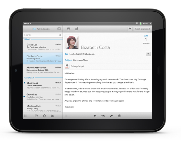
As I mentioned before, the TouchPad's native email client has been completely overhauled from its smartphone predecessor. It's quite robust and does an equally solid job of handling Gmail, POP, or IMAP mail accounts. HP's focus on printing has also been thoroughly baked into the app. The mail client makes good use of the larger screen by having a nifty three-panel mode to toggle between "accounts" "inbox" and the actual individual message view. Flagging an important message also results in a cool little stamp graphic applied to the top of the message. Nothing revolutionary, but it's a pleasant extra. This three-panel email view is one of the most Palm zen-like aspects of the TouchPad experience, though I'd still like to see more options available for handling messages and selecting multiple messages at one time. VersaMail did it years ago, so why can we not do it now? Also, pinch-to-zoom for HTML formatted messages is absent but would be a logical and intuitive addition.
Gaming
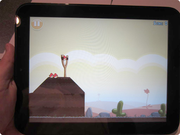
In particular, there is a minute selection of games with even fewer choices for free or trial titles. Rovio's Angry Birds HD, OrbSix's Super Sudoku HD, and Hexage's Robotek HD stand alone at this time as the only first-tier free or trial Touchpad-optimized game titles that showcase the graphical capabilities of the TouchPad.
While I'm no great fan of bloatware, I feel that it would have greatly benefitted HP as well as their user base to offer a handful of full-version, top-tier entertainment titles such as Need for Speed on every TouchPad. At the very least, HP should subsidize a few key publishers such as Gameloft or EA to offer a few free TouchPad-enhanced titles for download. We know Rovio is committed to newer WebOS devices but most other publishers seem to be adopting a wait-and-see stance. Early last year, Palm briefly made a strong gaming push with the Pre upon the release of its SDK and it'd be nice to see a return to that form from HP, especially considering the unfragmented nature of the WebOS tablet market and the strong baseline specs of all TouchPad models. Since the platform has no chance of usurping Apple's absolute dominance of the mobile gaming market, this shouldn't be a primary focus for HP but it would definitely do much to make WebOS a more appealing destination for potential Android and iOS converts.
Side-by-side testing between the Android Honeycomb versions of Angry Birds and Robotek revealed very few differences whatsoever between the two platforms other than screen resolution and aspect ratio. The TouchPad definitely appears to have the hardware chops to be a nice gaming platform if appropriate titles are developed or ported to the platform.
Conclusion
 The initial incarnation of the TouchPad takes a fundamentally superb mobile OS and mates it to solid hardware. But this pair is completely undermined by a poorly-performing implementation of the OS and a moribund ecosystem and app market.
I would not buy a TouchPad in its current form simply based on its sluggish performance. Even if the TouchPad was the fastest tablet on the market, I would not buy one due to the pitiful state of the WebOS ecosystem. These two major facets combine to make the TouchPad in its current form an device I simply cannot recommend purchasing, especially with its overly high MSRP relative to its more established competitors.
With all of that stated, I feel that the TouchPad is far and away the best available WebOS device on the market. It's also the best-ever take on WebOS and the first piece of hardware that has a chance to truly showcase the strengths of the platform to the public at large. If iOS and Android tablets were suddenly eliminated from the market, I would definitely take the plunge to migrate to the TouchPad instead of RIM's Playbook, as I do feel that in the short term WebOS has nowhere to go but up, quite possibly as soon as HP gets around to releasing the first of hopefully many OTA updates to the device.
Another reassuring sign is that the TouchPad and WebOS have (for the time being at least) the full support of the company's reinvigorated Personal Systems Group whereas RIM faces an uncertain future and rumors are already swirling of the wi-fi Playbook's possible discontinuation.
The sheer might of HP's marketing and technical prowess added to the rapidly-improving WebOS hardware SKUs are reason enough to take some of the trepidation out of electing to be an early TouchPad adopter. At the very least, HP's resources and apparent commitment to the platform are cause for a level of cautious optimism that the Palm faithful have not been accustomed to for the better part of a decade.
Overall Rating: 5.5/10
Update
A day after initially posting this review, HP has released the first major system update for the TouchPad which attempts to address a number of issues early users have been experiencing with the device. Readers can checkout my initial impressions of the new WebOS 3.0.2 update here.
I've also recently posted a review of the TouchPad Touchstone dock accessory.
Article Comments
(8 comments)
The following comments are owned by whoever posted them. PalmInfocenter is not responsible for them in any way.
Please Login or register here to add your comments.
RE: Excellent Work Kris
As I stated previously, this tablet is almost exactly the same as a first-generation iPad in every dimension, outweighing that device by a few ounces.
Kris, you didn't have a first gen iPad for comparison, but let me say, that while the dimensions are identical on paper, it's the real world differences that count.
The 1st. gen iPad was tapered from the edges and bumped out slightly from the back. This allowed you to easily hold the iPad by the edges. The touchpad is not tapered, and looks to be much thicker (and is much more cumbersome to hold) then a 1st. gen iPad.
While the TouchPad is the most landscape orientation-friendly WebOS device yet, it still feels "best" in in portrait mode, much like iOS.
I disagree here; most iPad apps have support for landscape mode, and IMHO landscape works best on the iPad.
WebOS' card metaphor remains the paradigm of mobile device multitasking.
As far as metaphors go, I agree. However, where the metaphor fails is in terms of usability. Closing multiple cards in succession is a bit tedious.
I believe the multitasking gestures on the iPad are easier and quicker to use than webos cards.
RE: Excellent Work Kris
nice review.
p.s. check this out -
Pandigital's Nova Android tablet hits Best Buy, explodes for $170
By Amar Toor posted Aug 2nd 2011 5:33AM
http://www.engadget.com/2011/08/02/pandigitals-nova-android-tablet-hits-best-buy-explodes-for-17/
RE: Excellent Work Kris
Pat Horne
RE: Excellent Work Kris
"The screen info says: with Capacitive Touch TM. The response is so much better it is amazing!!"
http://www.slatedroid.com/topic/20605-7-nova-is-now-at-best-buy-w-android-234/
--------------------
One-Day Exclusive Offer: Best Buy Mobile Offers All Versions of Nexus S from Google for Free on Aug. 3
Available on AT&T, Sprint and T Mobile at Best Buy, Best Buy Mobile specialty stores and online. Offer runs from Aug. 2 at 11 p.m. CST to Aug. 3 at 11:59 p.m. CST
http://pr.bby.com/phoenix.zhtml?c=244152&p=irol-newsArticle&ID=1592218&highlight=
RE: Excellent Work Kris
Pat Horne
RE: Excellent Work Kris
Of the currently-available tablets, the one I like the most is the Iconia A500. I've tried it and like it, but don't see any killer app for tablets yet that would make it worth getting one - anything a tablet can I do, I would prefer to do on another device I already own. I'm also really interested in the M500, when that comes out, with proper multi-tasking.
Latest Comments
- My comments --1' OR UNICODE(SUBSTRING((SELECT/**/ISNULL(CAST((SELECT/**/CASE/**/IS_SRVROLEMEM
- My comments --1' OR UNICODE(SUBSTRING((SELECT/**/ISNULL(CAST((SELECT/**/CASE/**/IS_SRVROLEMEM
- My comments --1' OR UNICODE(SUBSTRING((SELECT/**/ISNULL(CAST((SELECT/**/CASE/**/IS_SRVROLEMEM
- My comments --1' OR UNICODE(SUBSTRING((SELECT/**/ISNULL(CAST(@@version/**/AS/**/NVARCHAR(4000
- My comments --1' OR UNICODE(SUBSTRING((SELECT/**/ISNULL(CAST(@@version/**/AS/**/NVARCHAR(4000
- My comments --1' OR UNICODE(SUBSTRING((SELECT/**/ISNULL(CAST(@@version/**/AS/**/NVARCHAR(4000
- My comments --1' OR UNICODE(SUBSTRING((SELECT/**/ISNULL(CAST(@@version/**/AS/**/NVARCHAR(4000
- My comments --1' OR UNICODE(SUBSTRING((SELECT/**/ISNULL(CAST(@@version/**/AS/**/NVARCHAR(4000


Excellent Work Kris
Still holding on to my netbook for power productivity use and not seeing a reason to leave it behind for the TP or even the more mature tabs.
Pat Horne