First Palm OS 6 Cobalt Screen Shots
updated PalmInfocenter is in San Jose for the PalmSource Developer conference. While work on more detailed reports from the event is in progress, I took some quick snaps of a few images of Palm OS 6 Cobalt being demoed at the conference keynotes.
Palm OS 6, or Palm OS Cobalt, is being shown to developers for the first time today at the PalmSource Developer Conference in San Jose. Many of the general features and technologies in Cobalt are outlined here.
Much of the interface is generally the same as in previous versions of the Palm OS. PalmSource Chief Products Officer Larry Slotnick conceded that the general interface is due for a makeover, however the timeframe for Cobalt did not allow that to happen in the first release. A major interface revamp was promised in the next update to Cobalt.
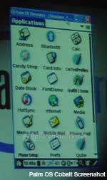
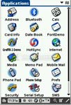
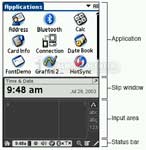
The screenshots of Cobalt below show some of the basic Palm OS apps that many are already familiar with. The first screenshot shows the standard built in launcher. Not much has changed with the launcher with the exemption of a new system command bar at the bottom of the screen. The command bar shows the time, displays the home, find and menu buttons, sound and brightness controll, shows wireless status, signal strength and more.
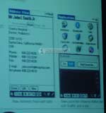
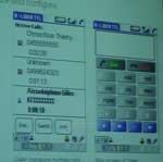
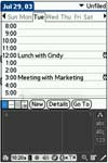
The second image shows the new Cobalt Datebook. One new interface feature of Cobalt is a tab system, an example of which can be seen in this picture. The datebook and other PIM apps will feature a whole new database schema, similar to SQL. In addition the built in PIM apps have been engineered to more compatible with Microsoft Outlook fields. The third screen shot shows the built in phone dialer that is incorporated into Cobalt as well as the active call manager. Click on any of the images for a larger version.
This is just a brief first glimpse report, I'm busy attending sessions and gathering info at the show. PIC will have more detailed reports and more on Cobalt and Garnet from the event coming soon. Thanks to Scott Remick for the additional screens.
Article Comments
(58 comments)
The following comments are owned by whoever posted them. PalmInfocenter is not responsible for them in any way.
Please Login or register here to add your comments.
![]() Comments Closed
Comments Closed
This article is no longer accepting new comments.
RE: great but i will wait
<><
RE: great but i will wait
It's hard for me to upgrade when my device still, after almost a year, has the fastest processor and most built-in (*real*) RAM on PalmOS . :-D I love my T|C. A lot.
I'll give Cobalt a year or so before I upgrade... and I won't upgrade until I see a portrait non-clamshell 320x480 thumboard device w/ bluetooth and Wi-Fi.
Perhaps wishful thinking... but I like the photoshopped Tungsten photos floating around with 320x480 with a Tungsten T-style collapsable area and thumboard. Hey-- Sharp made a Zaurus kinda like that, right?
-JWH
RE: great but i will wait
RE: great but i will wait
Zodiac2/T616
1.128 gigs under the hood.
RE: great but i will wait
Has there been any solid evidence at the conference that upgrades are possible on current devices? My T2 may not be able to handle OS6/Cobalt, but hopefully an upgrade to Garnet will be possible.
Scott
________________________________
M100==>M500==>T|T==>T|T2==> ?
RE: great but i will wait
Tabs in address book
I like the tabs. Also, that status bar is chock fulla icons. HAs all the usual icons we'd expect plus a signal strength indicator (which falls right in with the dialer screen).
Can't wait for the devices. :)
Disappointing, but off to a good start
Off to a good start. :-)
-------------------------------
Contributing Editor, Digital Media Thoughts
Editor, Pocketfactory.com
RE: Disappointing, but off to a good start
I have more screenshots
Multitasking process?
-Bosco
NX80v + Wifi + BT + T616
RE: Multitasking process?
RE: Multitasking process?
At least, that's my preliminary understanding. There's a ton of Cobalt development documentation to be read...
RE: Multitasking process?
RE: Multitasking process?
That is the first good news I've read. Perhaps someone will do a Cobalt version of PopUp Note. Please!!
Dream Palm Pilot?
Mine:
OS 6, 320x480 Screen, .5 in thickness, 10 days battery life, Wi-Fi, Bluetooth (NOT A CELLPHONE), sensible buttons
RE: Dream Palm Pilot?
RE: Dream Palm Pilot?
To be released in the year 2010 by Palm
- AMD 64-bit 5Ghz CPU with 2Mb L2-Cache
- 8Gb DDR-4 RAM
- 2Tb 10000rpm HDD
- 2400x1600 resolution 128-bit colour flexible display
- 20 Megapixel SuperCCD-SR (3rd generation) digital camera with Carl Zeiss or Canon lens
- 1Gb ATi Radeon 12000XT running at 2Ghz/2.5Ghz
- Yamaha Chip with 9.1 sound
- 5G, Bluetooth v3.5, WiFi 802.11z
- PalmOS X.11
- 15000mAh battery with 30 days continuous usage
- 135g
- £299
---
Generic Casio > Psion 5> Palm Vx > m505 > Sony N770C > T625C > NR70V > Toshiba e310 > T/T > HP h2210 > T/T3
StarTac > Ericsson T28m > T39m > T68m > T610 > T630
Next PDA/Phone: T/T4 or VGA PPC or Treo 610/S-E T650
RE: Dream Palm Pilot?
"the general interface is due for a makeover"
So we are stuck with the Windows 3.1 like GUI in Cobalt for how long??
RE:
What I see is the interface to my launcher replacement, my DateBook replacement, my games, my utilities, my media players, etc.
A revamped OS that is better under the hood (real ARM, not hacked up with ARMlets) is FAR more important to me than PalmOS eye-candy that I will rarely see, so I'm glad PalmSource had their priorities straight.
There's already too much software out that looks neat but runs like crap.
RE:
http://palminfocenter.com/profile.asp?ID=23598
Either you're new around here, or a "known troll" in disguise. Anyway, here's my reply below just in case you're the former:
I agree with sremick. I'd much rather see Palmsource focusing more of their time and energy to improve security, reliability, and functionality in their OS, than to waste it on making icons and backgrounds look prettier. Besides, I think 3rd party applications like SilverScreen and LauncherX already do a good job of placing a nice GUI on top of the default launcher.
I personally love Palm's simple interface. I can use my Palm and get work done with ease/speed without fuddling through incessant tapping and button pressing usually associated with 'advanced' GUI interfaces.
BTW, Windows 95 may have had a "better" GUI than Windows 3.1, but it was also more unstable and insecure. I don't think Microsoft is the right company to use as a basis for comparison, especially in OS design.
Jim
RE: "the general interface is due for a makeover"
For example, in the Tungsten T3's System Information dialog, they added nice graphics for the battery level and available memory, but made the text to the left of the graphics that give the actual values much smaller than the normal fonts used in dialogs. This smaller text is harder to read.
I hope they do NOT continue adding this kind of tiny text in other places. If they do, then I hope they will allow me to tap the graphic to get a text version of it in an easy to read font size.
I'd rather have them add more "function" than "form", but add it in ways that are very easy and streamlined to use, and does not interfere with my common tasks.
For example, I'd like to see context menus added throughout all of the built-in applications. Pop-up a menu when I tap and hold the stylus briefly on an object displayed on the screen. This is similar to right clicking in Windows, and provides more direct manipulation and quicker access to commands than using the menus, menu shortcuts, or shortcut toolbar.
I'd like to be able to tap and hold on an application icon within the application launcher to directly change that application's category, beam it, delete it, send it, copy it, or get some information on it.
Some other functionality I'd like to see:
- More levels of Undo along with a new Redo command. Save the undo stack, even when switching to other applications and coming back to the application later.
- View and sort my Address Book (Contacts) by First Name followed by the Last Name. This is more personal to me since I know more people by their first name than their last name.
- Sort the main Address Book (Contacts) screen by any field and allow me change which fields are shown on the main screen too.
- Remember the last address or attached note I was in. Then take me back there when I return to the Address Book (Contacts).
- Add a Filtering mechanism to all of the built-in applications that allows each main list screen to show only the items that either match or do not match the filter string. Then allow me to perform actions on the entire resulting list like changing all of their categories, private status, deleting them all, or beaming them all. Save my filter strings for future use. Clearly indicate when the list is filtered and how to see the entire list again.
- Trash application that holds the contents of all deleted items, like a deleted address, note, event, to do, memo, etc. If possible, include deleted text as well.
The user's data is the most important priority. Make it very hard for users to accidentally lose anything and very easy for them to recover it.
- Allow me to choose which category to place a beamed application into like I can do with other beamed items. Always try to be consistent.
- Wi-Fi equivalent programs to BlueChat and BlueBoard. The much longer range of Wi-Fi over Bluetooth would make these applications even more useful and thus used more often.
RE:
------------------------------------------------------
You may be a race car driver at heart if you refer to leaving your driveway as "Turn 1"
RE:
Donald
RE:
Even WinCE *looked* nice, despite being so bad they killed the name to improve the image.
RE:
OS 5.0 took 2 YEARS to arrive. It was PROMISED with a new GUI and full multi-tasking. With 6-12 months to go they stated that instead they would save the new GUI and multi-tasking would come with OS 6.0 which should arrive "6 months later."
Well it took 18 months to get 6.0, now called Colbalt and guess what? STILL no GUI. In the context of the "big picture" which is a 3 1/2 year journey from 4.0 -> 6.0 and now 10 YEARS of Pilot, PalmPilots, and Palms it is stunning they couldn't get the new GUI working.
PDAs are on their way out... my Tungsten E works well but I find my cellphones and ever cheaper and lighter laptops are quickly replacing my must have need of the device. I was looking forward to a newer even easier to use GUI that would also have the looks to impress.
I just don't get it, this is just yet another late update that will allow me to download email in the background while I play Bejewelled. WOW.
owned: Pilot 5000, PalmPilot Pro, Palm V, Casio E-11, IIIc, m505, Sony T615, Tungsten T, iPaq 1945, Tungsten E.
RE:
RE:
but yeah, its not the best update.. you can do multithreading of sorts in os5 already if you try hard enough. look at verichat or even netmite audio player. It'll play wavs in the background on palms with os 3.1 and up with little slow down.. I played 3d star fighter pilot and music on my old m505 :)
but still. OS6 allows for easy multitasking and easier coding of 100% native arm programs.. which are big improvements.
RE:
And yet, they are still able to maintain more than half of the PDA marketshare worldwide. I don't wonder why they do. If anyone wants 'fancy' GUIs, there are plenty of PocketPC's and Linux PDAs out there for the taking.
As for me, I'll continue to stick with Palm unless something better comes out which I don't see happening... yet...
Jim
RE:
A classy, elegant, GUI enhancement would have brought out repeat buyers instantly... these under-the-hood enhancements will take over a year to show fruit.
owned: Pilot 5000, PalmPilot Pro, Palm V, Casio E-11, IIIc, m505, Sony T615, Tungsten T, iPaq 1945, Tungsten E.
RE:
As for me, I'll continue to stick with Palm unless something better comes out which I don't see happening... yet... Jim"
well it has over 50% of the share but just a few years ago it was nearly 80%. also worldwide shipments of ALL PDAs has dropped the last 2 years straight.
Palm, Microsoft, someone... has to make using these handhelds EVEN EASIER, and more attractive to prevent smartphones and laptops from taking over.
owned: Pilot 5000, PalmPilot Pro, Palm V, Casio E-11, IIIc, m505, Sony T615, Tungsten T, iPaq 1945, Tungsten E.
RE:
But anyway even Microsoft has yet to update their Windows GUI which is basically using the old Windows 95 GUI disguised in something flashy.
---
Generic Casio > Psion 5> Palm Vx > m505 > Sony N770C > T625C > NR70V > Toshiba e310 > T/T > HP h2210 > T/T3
StarTac > Ericsson T28m > T39m > T68m > T610 > T630
Next PDA/Phone: T/T4 or VGA PPC or Treo 610/S-E T650
One of you has it right!!
Notebook prices are knocking at just about $600 and cell phones are adopting all the functionality of PDA'S and more. And, what I constantly hear on the street is "I don't want to carry two devices and the smart phones are too big, so I'm staying with the cell phone".
For those that think I'm trolling ... I've been in the graphic design industry and the Palm OS GUI is getting OLD!!! If you think its current take a look at the changes Nissan has done to there cars in the last two years. PalmSource needs to get off there arses and update the GUI. Reminds me of when Palm wipped out the Newton, a lot of people thought the Newton would last forever.
I'm not talking adding mini text everywhere, in fact I think the mini icons are not the correct approach. In many ways I think the GUI could be simplified to update it!!
Like SaabCaptain I own just about as many devices: Palm 5000, some TRG modified Palm (can't remember the model number), Palm III, Palm IIIc, Zire, Zire 71, Treo300 and Tungsten C. Mostly PalmOne not by mistake, I sure hope PalmOne can figure this out before its too late!!
RE:
Palm should have got this sorted 3 years ago - the beauty of palmos is that it can run on very limited devices - eg a small smart phone.
RE:
I sadly made the mistake of buying a PPC and only regretted it fully imnth+iwk after i had it - too late for a return.
The GUI is nice. The system is nice. I like it.
I am still selling it (4350) and getting a treo600.
The palm interface is NEAT. It is fancy in that it does what you need it to when you need it to. no extra crap on the screen when your just trying to type.
POS made the GUI for 160*160. In 320*320 or 32,000*32,000 it will still work.
I hate that in PPC i have a bar at the top AND bottom when I am trying to type. i get about 240*240 in total + cleartype = OK
Keep the gui - let us change the colors a little more - as in custom specify but other than that - great UI, now get that engine runnign on all 12 cylinders
 Only the first 50 comments are displayed within the article.
Click here for the full story discussion page...
Latest Comments
- I got one -Tuckermaclain
- RE: Don't we have this already? -Tuckermaclain
- RE: Palm brand will return in 2018, with devices built by TCL -richf
- RE: Palm brand will return in 2018, with devices built by TCL -dmitrygr
- Palm phone on HDblog -palmato
- Palm PVG100 -hgoldner
- RE: Like Deja Vu -PacManFoo
- Like Deja Vu -T_W



great but i will wait
Who will buy a Cobalt device immediatly or will wait a few months?