Treo 500v Review
 By: Tim Carroll
November 25, 2007
© PalmInfocenter.com
Just over two years ago, when Palm proudly announced they were going to start selling Windows Mobile devices, the Palm OS community was in uproar. "The final nail in the coffin!" shrieked some (with no small amount of disgust). "Palm OS is dead!" thundered others. The share price took a tumble, the bloggers put the boot in and even the most faithful fans found themselves wondering if this was the beginning of the end.
Unsurprisingly, perhaps, it wasn't. As a matter of fact, it's been a boon for Palm: selling Microsoft-powered devices has enabled them to jam their (somewhat bruised) foot in the door of several large enterprises as well as international markets that would have otherwise turned up their snooty European noses at them and their simple-but-homely Garnet OS. The Treo 500v is the third and latest love child to be produced by the Palm-Microsoft affair. In addition to being the thinnest Treo yet, is also sports some other oft-requested hardware specs, including a 2-megapixel camera (finally!), Bluetooth 2.0 and a widescreen display. Its launch was a testament to the strength of the carrier relationships that Palm has been able to build over the three years theyve been selling smartphones: in collaboration with Vodafone, the 500v has seen a swift rollout across twelve countries in less than two months. Like the recently-released Centro and last year's Treo 680, Palm is targeting the 500v at entry-level consumers who may have never used a smartphone before but are ready to upgrade.
Have they succeeded in creating Average Joe's smartphone? Or is it just another me-too Windows Mobile device? Why am I asking you, when it's my article? Read on for the answers to these & other scintillating questions in PICs in-depth review
Look & Feel
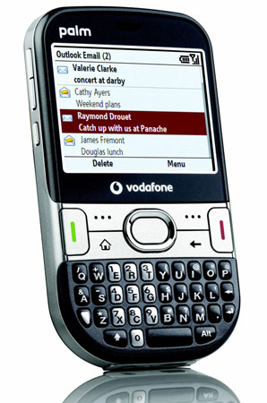
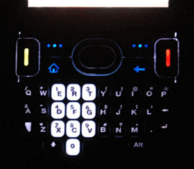
Along with the new Palm Centro, the Treo 500v features the first genuinely new Treo façade since the Treo 600s debut back in 2003. Gone is the signature chrome bezel around the screen, as is the smile-shaped keyboard and hard buttons. In their place are a new straight keyboard with fractionally smaller keys (and by cleverly shrinking down the font sizes, Palm have made it look like a much bigger difference than it really is) and a redesigned hard-button arrangement thats strongly reminiscent of the ill-fated Lifedrive. In addition the new, larger, oval-shaped Pickup and Hangup buttons are painted with much brighter colours that stand out very distinctively, even when not backlit.
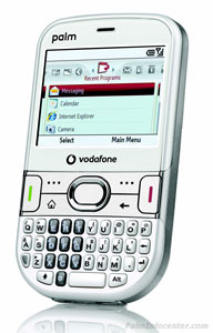
As mentioned in the introduction, the Treo 500 is Palms thinnest, most lightweight Treo to date. (Not including the Centro, which is 1 gram lighter.) Were talking exact dimensions of 110 x 62 x 17mm (.65" x 2.4" x 4.3" inches) and tipping the scales at 120 grams (4.23 ounces), putting it in the same territory as devices like the Blackberry Curve and the Motorola Q (which measure up at 107 x 60 x 16mm / 111g and 118 x 67 x 12mm / 125g, respectively) Its marginally wider than the Treo 680/750/755 chassis (by 4mm) and microscopically shorter (by 1mm). As has been the case with their last few smartphones, Palm is offering the 500v with a choice of colours: either "Charcoal Grey" or "Glacier White". My review unit was the former, and it looks quite nice indeed.
Layout
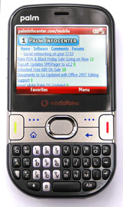
Whilst the styling has changed, the Treo 500s face remains true to its heritage. (This is either a good thing or a terrible thing, depending on how much you like QWERTY candy-bar designs.) The earpiece speaker that sits at the top the device is now a simple exposed hole on the flat surface, rather than the covered bump on the 680/750/755 chassis. Beside this on the right is a small circular charging LED, which like the Treo 750 is (nearly) invisible until illuminated. Underneath you have the new rectangular widescreen display which, due to the removal of the touch capabilities (and thus no longer having to worry about mashing it with your ear), now sits flush with the rest of the device. Its a welcome and attractive change.
Below the screen are the redesigned hard buttons and D-pad. Now arranged in a 2x2 grid, you have two dynamic softkey buttons, a Home button and a Back button. On either side are the Pickup and Hangup keys, which are much larger than on previous Treos and more comfortable to press. Larger too is the select button on the D-pad, also making it much easier to hit than the small nub of old. Apart from the D-pad, the buttons are completely flat and flush. And finally, you have the QWERTY thumb-board down the bottom.
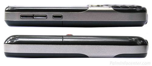
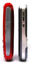
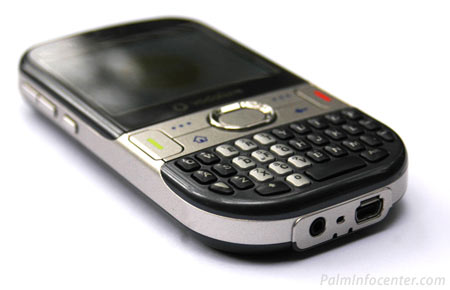
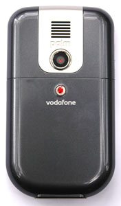
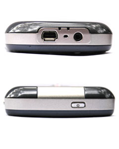
A small, recessed power button thats infuriatingly difficult to press one-handed sits on top of the device, where the silent-mode switch used to be. Along the left hand side are the usual two volume buttons and side key, and stuck on the backside are the speaker grille and camera lens in their usual positions. Just like everything else, the camera is (nearly) flush with the casing meaning its much more likely to get scratched and smudged. (My review unit already had a couple of very tiny scratches when it arrived, although who knows how many hands it had passed for before mine.) Along the bottom you have the 2.5mm audio jack that weve all come to know and hate, a small hole for the microphone and the mini-USB socket.
Absent from this model are the topside mute switch, the external memory slot, the IR window, and the Athena connector. More on that later.
Feel
After toting the curvaceous Treo 680 for the last year which, despite its fat body, feels like its been moulded for your hand the Treo 500v feels very odd. Apart from the keyboard and D-pad its just a completely flat slab of plastic with rounded edges. This combined with the new (slightly) wider, thinner body means that the 500v doesnt actually feel that nice to hold. Rather than supporting it with your whole hand, you wind up sort of perching your fingers around it - and you have to stretch them slightly to get the best grip. Still, it didnt take me very long to adapt. Whilst the plastic is smooth, it never feels like its going to slide out of your hand and is reasonably grippy.
The biggest, most noticeable difference from earlier Treos is the weight: after hauling the aforementioned 680 around, the 500v was almost like a toy. It feels great in your pocket and you can find sometimes yourself forgetting its there something that never happened with the last series. (So, is that a ridiculously large phone in your pocket, or...?) Also very much unlike earlier models, the 500v passed the Oo test with flying colours: most people who saw me carrying it wanted to take a closer look and those that did were quite impressed. (By the phone, not me, although Im sure I helped.)
Build quality is excellent easily the best of any Treo so far. The 500v feels solid: theres no give on any part of the device, unlike, say, the battery door of the Treo 650 or those rubbery runners on the sides of the 680. Some have described it as feeling fused together. Its an apt description, helped along by the way the buttons and screen have been flattened. Im amazed that this is the same device as appeared in those horribly ugly, blurred spy shots that surfaced earlier this year. The 500v is the best-built, best-looking Treo yet.
Hardware
At the heart of the 500v is the fastest CPU yet seen in a Treo. With a clock speed of 416 MHz, youd expect a blisteringly fast performance, right? Wellllll.... not quite. Those moving on from Treos past especially Palm OS models - will find the 500vs frequent slowdowns as welcome as a slap in the face with a wet fish. The button response is frequently laggy, applications are slow to open and multimedia performance - particularly Bluetooth A2DP - is average. While the target audience for this phone is likely to be moving up from a similarly sluggish handset - and the experience is certainly no worse than that to be had on your usual Nokia or Motorola feature phone its still quite disappointing. On the other hand, while the performance might be sub-par, the memory certainly isnt: with 256mb of RAM and 150mb of that available for user storage, the 500v is Palms most RAM-packed Windows Mobile device yet and can fit plenty of files and applications on board with room to spare.
 Display
The 500vs screen immediately scored points with me, purely out of the novelty of being the first Treo without a square screen. If theres one universal truth in this life, its this: it always looks better in widescreen. The 500v proves this quite nicely: despite having a physically smaller display (its barely a millimetre or two bigger in width and significantly shorter in height than past Treos), everything from web browsing to videos to boring old emails looks more natural and is more comfortable to read in this format. Also appreciated is the jump in resolution from Palms previous WinMob devices, which ran at a rather shameful 240x240. At 320x240 text is beautifully crisp and clear (ClearType is enabled by default, unlike the Treo 750) and photos & videos both look great as well. Its just as bright as previous Treos have been, and is perfectly readable under even the brightest outdoor conditions. Provided you dont live on Mercury. And if thats the case you dont want the 500v anyway. Vodafones coverage there is awful.
Phone / Data
With a tri-band GSM/UMTS radio, the Treo 500v isnt exactly a world phone like its big brother, the Treo 750. But the international roamer is not the market this is being pitched at, so its of little consequence anyway. Disappointingly, its not upgradeable to the faster HSDPA standard, but again, its good enough for the purposes of the target audience. By default, it accesses UMTS networks and will fall back to GPRS when 3G coverage isnt available. Here are the results of four speed tests taken using dslreports.coms handy mobile speed test with a 1mb file:
Test 1: 129 kbps
Test 2: 196 kbps
Test 3: 241 kbps
Test 4: 181 kbps
Average speed: 187 kbps
The usual caveats about signal strength and local cellular coverage apply: these results will vary from user to user. That said, these scores are a little disappointing compared to the Treo 750, which positively aced the test and achieved scores in the 3-400kbps range. Still, you cant really blame the device: after all, its only as fast as the network its connected to (in this case, Vodafone Australia).
Phone performance is above-average, but not fantastic. While quite clear, voices sound artificial and digitized, and the earpiece is a little quiet even at maximum volume. Its no problem under normal conditions but in noisy environments you may find it a little difficult to hear. On the flipside, the speakerphone is plenty loud and has no such issues.
The SAR score has seen a small reduction from the Treo 680, with a maximum rating of 0.74 w/kg. SAR, for the curious, is a measurement of how much signal radiation is absorbed by your head when you hold the phone up to it (in watts per kilogram), and 0.74 is a relatively low reading. (By contrast, the 750 scores 1.26 w/kg and the 680 0.78 w/kg.)
Camera
Finally, a Treo camera that keeps up with the Joneses! While the 500vs 2-megapixel camera isnt going to make you throw out your SLR anytime soon, its a massive step up in quality from the decidedly sub-par 1.3 & 0.3 megapixel cams Palm has given us in the past. The biggest problem with those past cams the blurring of fine detail has been mostly corrected, and pictures are even more bright n colourful. But there are two new issues with this one: first, the slightest motion will result in a hideously blurred picture (I realise this is a problem with most camera-phones, but the 500v seemed particularly susceptible). Second, the shutter speed is criminally slow; theres a near 2-second delay between the time you press the button and the picture actually being taken, which will often lead to blurred pictures (because youve moved the camera, thinking the picture has already been taken, when it hasnt) and doesnt lend itself well to action shots. Overall, however, its a much-needed improvement and makes the camera far more useful, in that you actually want to use it.
Video recording has also been improved: while the maximum resolution has dropped slightly (from 352x288 to 320x240), the videos themselves look much better, which Im guessing is due to the superior encoding of the mp4 format that theyre now saved in . The framerate is smoother and theres much less pixellation, even during fast motion. Sound quality is also slightly improved, in that the gain on the mic seems to have been turned up a bit. Its not exactly television quality, but its certainly good enough for MMS and that Youtube thingamajig that all the kids are into nowadays.
Below are four unedited sample photos taken under various lighting conditions. They are unexciting. Sorry.
Bluetooth & Audio
Palm has upgraded the 500v to Bluetooth 2.0, which means that Bluetooth performance is the best yet on a Treo. Bluetooth 2.0, apart from allowing more stable, longer-range, clearer connections, also features a higher data rate than earlier versions, making for blazing fast file transfers and performance. A2DP audio for use with wireless stereo headphones is natively supported, although overall device performance slows down considerably while its in use.
The wired side of the audio equation is not so good, though. Were still plagued by that accursed 2.5mm headphone jack, whose fragility and incompatibility with most headphones becomes ever-more infuriatingly frustrating with each successive Treo that Palm insists on handicapping with it. Its an anachronistic joke, a throwback to the days when mobile phones were just a fancy way to get brain tumours and not media players too. After my Treo 680s jack died barely a month after I bought it requiring a replacement unit I have utterly no patience left for this shoddy contraption. The time has come, Palm: kill the 2.5mm jack. Kill it now.
 Oh, and as usual, we have the monaural rear speaker, which sounds fine for speakerphone and ringtones, but you wouldnt want to listen to it for any great length of time.
Battery
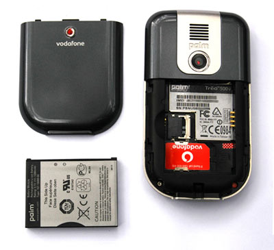
The Treo 500v is fuelled by a removable, 1200mAh lithium-ion battery. It provides around 4.5 hours of talk time and Palm claims 10 days standby, although going by the performance of Treos past Id say you can expect maybe three or four days. Despite being identical in size and capacity to the battery found in the 680 and 750 models, Palm have opted for a new design, so anyone hoping to bring forward their old batteries as spares will be disappointed. Its not really an issue once again, Palm is looking for new customers here - but it did seem like an odd choice to me. Wouldnt it have been cheaper to just churn out more of the one kind of battery?
QWERTY thumb-board
As mentioned earlier, the keys on the 500vs QWERTY board are fractionally smaller than that found on recent Treos. Overall, it wasnt the size of the keys, nor the long, straight arrangement, that made it feel so different. It was the stiffness. The keys on the 500v are very firm and its unlikely youll ever press one down by accident. This isnt a bad thing, it just takes some adjustment. And after a couple of days, I came to like it better than the earlier keyboard design: the devices extra width makes two-thumb typing feel more natural and leads to less mistakes (or so it felt). A quick typing test had me pegged at about 36wpm.
|
TREO 500 SPECIFICATIONS
|
|
| Size & Weight: | 16.5mm (D) x 61.5mm (W) x 110mm (H) (.65" x 2.4" x 4.3" inches) 120 grams (4.23 ounces) |
| Processor: | 416 MHz Marvell PXA270 processor |
| Operating System: | Windows Mobile 6.0 Standard |
| Memory: | 256MB memory (150MB available user storage) |
| Expansion: | microSD slot |
| Screen: | 320x240 pixel; 65k-color; transflective back-lit |
| Audio: | 2.5mm jack; monaural rear speaker, polyphonic MIDI, MP3, & WAV ringtones, Bluetooth A2DP |
| Power: | Replaceable Li-Ion Poly (1200 mAh) |
| Connectivity: | GSM/GPRS/UMTS radio: GSM bands 900/1800/1900, UMTS band 2100, Mini-USB connector, Bluetooth 2.0 w/ EDR |
MIA
 One of the first things that prior Treo owners will notice about the 500vs hardware is the ringer switch. Or rather, its absence. Its one of the Treos most iconic, simple features, whose practicality speaks for itself. Yet for some completely unknown reason, Palm have eliminated it from this model. The question begs, why? Its not expensive. Its not like it couldnt have been recessed into the casing like everything else, thus ruining the look. And its certainly not like people were demanding its removal. The ringer switch is important, Palm: its one of those little things that keeps people buying your phones and not some sexier competitor, and by removing it youre sabotaging your own efforts.
Hot-swapping memory cards has become a thing of the past, with the 500vs microSD expansion slot hidden under the battery. If you want to quickly swap out the card to transfer files to or from another device, then too bad, loser! I can understand why its been locked away its helped Palm keep the size down as well as contributed to the one-piece look n feel of the whole unit but it really does get annoying having to pull apart your phone every time you need to get at the memory card.
Palms "Athena" multi-connector has also been banished, and I say good riddance. Sure, itll render the 500v incompatible with past Treo accessories, but with the new design that was probably a given anyway. In its place we have a standard mini-USB plug, which is a far superior option: its not nearly as fragile or failure-prone as the exposed-pins Athena arrangement and is near-universally compatible with all kinds of devices. If you need a spare cable, you can pick one up from practically any computer store for cheap, the same of which cannot be said for the proprietary Athena. Heres hoping Palm makes this standard across all their devices, although given that the new Centro is still lumbered with Athena those hopes will most likely be cruelly dashed against the rocks of despair by the waves of design stupidity.
Also absent from the Treo 500 is the IR window, although I cant say it really matters to me. Ive rarely used IR and Im not going to shed any tears over it, but Im sure theres someone out there who is plaintively mourning its demise. I feel for you, but get off my lap.
Software
Operating System
The Treo 500v is Palms first device to run Windows Mobile 6 Standard Edition, a.k.a. the Artist Formerly Known As Smartphone Edition. Functionally, I noticed few differences from the WM5 Pocket PC Phone Edition (now known mercifully - simply as Professional Edition) that runs the show on the Treo 750, apart from the obvious lack of touch capabilities. Cosmetically, its been given a facelift, with several different colour themes to choose from (the default is a very bland black-on-white. I recommend Guava Bubbles, cause Windows Mobile Green is disgusting) and a very polished feel. Its still very much the same interface as came before, but theres an extra layer of sheen over everything that makes it just that little bit more eye-pleasing. Fonts especially are smooth and attractive.
Windows Mobile 6 is still making the all the same UI mistakes as WinMob 5, with those giant status & softkey bars still taking up way too much room (and the problem is even more pronounced this time around, due to the screens smaller vertical width) and too many functions hidden away under menus. One improvement this time round has been the shrinking of the scrollbars: theyre now just teensy slivers on the edge of the screen, allowing apps to take full advantage of the extra width available. Of course, this is only due to the fact that they dont need to be big enough to touch on a non-touchscreen device, rather than any genius design decision, but its still welcome. As mentioned in the hardware section, its disappointingly laggy in its response, especially considering the extra grunt at its disposal. As always with WinMob, it gets worse the more applications you have running - although to be fair the problem seems less pronounced on WM6.
 The big draw for the Treo 500v is the new carousel-style Start menu, which divvies up the various parts of your digital lifestyle music, photos, calendar, contacts, etc into a bunch of separate tabs with shortcuts to the most recent items, new messages, upcoming events etc. A neat little sliding animation (although it isnt exactly iPhone quality) takes you from tab to tab. In some respects, the design is quite innovative, but it also has limitations. It can be slow-going to get from one end of the tabs to the other, and some obvious (at least to me) things seem to be missing, not the least of which is an applications tab. It is, however, dead-easy to learn, and the way it displays the most recent items on most menus will be much-appreciated by those whove struggled with the multimedia functions of lesser phones. Overall, its decent, but limited just a fancy launcher, really. Id be more impressed if we were given more control, like being able to customise the order, number and type of tabs to suit your own needs, as well as the ability to choose what appears on them. But it is what is is.
And that, dear readers, is it as far as software customisation goes for the 500v. Dig any deeper than the carousel, and youll find nothing but a bog-standard Windows Mobile phone. Theres none of the innovative software that Palm developed for the Treo 750: no custom Today screen, no simple chat-style SMS system, no interface enhancements in sight. Just the regular Microsoft software package. Exciting, huh? Lets get it over with quickly and then bag this sucker...
Phone & Messaging
Its pretty straightforward. By default, the Home screen is a blank canvas that displays the date, time and cellular network, with none of Microsofts usual plugins. Just start typing to lookup a contact or dial a number, press the green button to bring up the call history, or press the softkeys to bring up the Start menu or go to Vodafones rather threadbare live! service, where you can download the usual assortment of ringtones*, pictures, videos etc for outrageous prices.

You can change the Home Screen layout and colors to suit your preferences, with the option of a few different themes, each with different plugins. Personally, I liked the Windows Live layout in Blue, which had a handy Messenger plugin and displays your most recent applications.
As for messaging, what is there to say? If youve ever used SMS on a phone before youll have little trouble working it out. Theres nothing special to make the 500v stand out from the crowd here, which is truly disappointing from the company that originally gave us threaded, IM-style SMS. Why have you abandoned your own innovations, Palm?
* Including, disturbingly, a whole new category Ive never seen before called Orgasm Tones. Yep. You heard me. Orgasm Tones. As in, your phone will make the same noise as a man/woman reaching sexual climax when it rings. Thats not going to be awkward in public at all, Im sure.
Internet & Email
Standard mobile IE, standard mobile Outlook. Outlook thoughtfully configures itself for most popular email services and can be set up in a few simple, easy steps based only on your email address, which is sure to please those whove struggled with it on basic phones.
As for IE, its a competent mobile browser, but it suffers painfully from the lack of a touch screen. Scrolling is slow. Really slow. Long pages are damn near impossible to get through, especially those with multiple columns. If there was an option to speed it up, I couldnt find it. Plus, the rendering speed leaves a lot to be desired heck, it was slower than Blazer on some occasions. Passing grade, nothing more.
Of particular appeal to IM-addicted kiddies will be the Windows Live application suite, which includes an excellent pocket version of Windows Live (formerly MSN) Messenger. Theres also links to Hotmail and the somewhat ho-hum mobile version of Spaces.
Multimedia
Apart from a new WMP 11-style interface, the pocket version of Windows Media Player included on the 500v is the same as its always been. It still supports only a smattering of file formats - WMA, WMV, mp3 and mp4 and provides only the most basic playback options. It syncs with Windows Media Player, but infuriatingly will automatically convert all your media to WMA/WMV format unless you tell it not to. With video this is understandable its actually quite handy having it built-in to the sync software - but music? Re-encoding already compressed audio just leads to crappy-sounding music for a relatively tiny decrease in file size. Bad Microsoft! Overall, its alright for everyday use - although the lack of support for things like album art is disappointing but power users will probably want to consider a more fully-featured alternative, like Coreplayer. Wireless audio via Bluetooth A2DP is fully supported, but the audio quality is lacking and it slows down the device considerably. Theres also a decent selection of mobile TV streams to choose from, but they look absolutely terrible at full screen (waaay too blocky and pixelated) and all cost extra, barring a smattering of free stations.

Also included is WinMobs standard photo & video viewer, which is just a run-of-the-mill thumbnail-navigation interface with no noteworthy tricks to speak of. You access the camera through this app as well.
Finally, you have the mobile versions of Word, Powerpoint and Excel, which are heavily-stripped down versions of their desktop counterparts that allow you to view and edit documents while on the move. All of these are simple to use, but very basic in their functionality. (I should also mention that Words smooth scrolling in View mode looks like a million bucks.) Theres also a crap PDF reader, which takes so long to render pages youll grow a beard waiting, provided you havent already slit your wrists from the misery of it all.
Contacts & Calendar
Thankfully, the calendar is a little more thoughtfully designed on this version of WinMob. Rather than showing an empty space for each hour of the day, the Agenda view will only display upcoming events, and has a cool horizontally-scrolling indicator along the top of the screen that provides a visual representation of the length of the appointment.
 Contact management is neatly handled, and integrates with your online Windows Live contact list a nice way to keep all your contacts in one spot. The usual find-as-you-type search method works as well as it always has. It syncs with Outlook on your desktop and does so without any fuss.
And with that, ladies and gentleman, we conclude our look at the 500vs software, but before we close the book it would be remiss of me not to note that there are hundreds of extra software applications available online for Windows Mobile, which can expand the usefulness of the device immeasurably. You should also note theyre always better if you buy them from the Palminfocenter software store, which sprinkles a little bit of magic pixie dust* on every download.
*Do not inhale the dust. PIC is not liable for any deaths.
The Verdict
Oh dear.
For a company that has built its business on making thoughtful, user-friendly devices, Palm has put surprisingly little effort into the Treo 500v. Aside from a fancy new Start menu, theres been no attempt at all to make this device their own. With none of the usual Treo trademarks like the touchscreen, threaded messaging or the ringer switch you could be forgiven for thinking this was another companys device. Theres a Palm logo on it, sure, but apart from the Treo name, what was their contribution here? The carousel was developed by Vodafone, the OS by Microsoft. The upgraded hardware specs are greatly appreciated, as is the significantly thinner chassis, but the fact is that they still dont put Palm ahead of the pack it just makes sure theyre keeping up with it. If they had given us built-in GPS, or heaven forbid wi-fi, that would have made them a front-runner amongst similarly priced QWERTY-phones like the Motorola Q. As it is, theres no truly compelling reason to choose the 500v over its competitors not unless you really wanted something called Treo.
The price is very attractive its free on a two-year plan in most countries and its got a great body. But once you dig beneath the surface, youll find it that there isnt much underneath. The Treo 500v is soulless. If youre a smartphone geek, you should definitely look elsewhere. If youre Average Joe looking to buy your first smartphone, then the price and looks might suck you in, but the sad truth is youd probably be just as happy with another device. With no truly unique features to speak of, the 500v serves its purpose but it wont engender loyalty. Better luck next time, Palm.
The Treo 500v is currently available worldwide via Palm and Vodafone. This review was done on an Australian unit, which is available from Vodafone stores and online at vodafone.com on a range of plans.
Article Comments
(32 comments)
The following comments are owned by whoever posted them. PalmInfocenter is not responsible for them in any way.
Please Login or register here to add your comments.
RE: Good review
Btw, I'm pretty certain that the Centro doesn't have a "smile" keyboard. Its keyboard virtually identical to the 500v keyboard which is pretty much the same as the Treo 600's keyboard. Now if you want to talk about classic Treo's, you have to go all the way back to the Treo 180 and 270 with their wide, straight keyboards with widely spaced oval keys. Curiously enough, the keys on the 180 and 270 were actually slightly smaller than the Treo 600's more closely spaced but bulbous keys. The 680 made the keys bigger still by making them more rectangular.
The current Palm keyboard seems to be a compromise between the older Treo 680 style and the still older Treo 600 layout. Just straighten out the parallelogram 680 keys line them up in a straight line as with the 600, throw in the LifeDrive's piano key hard keys and condom ring nav-button, and shrink it all down a bit and you have the Centro/Treo 500v layout. Now, if only Palm would bring back the Tungsten T3's slider so we can have a 320x480 Treo.
Speaking of the 500v camera...
http://www.mobiletechreview.com/feature/sony_NZ90.htm
It was hard to find a cheap digicam with image quality like this back in '03, much less in ANY multifunction mobile device!
Pilot 1000-->Pilot 5000-->PalmPilot Pro-->IIIe-->Vx-->m505-->T|T-->T|T2-->T|C-->T|T3-->T|T5-->TX-->Treo 700P
RE: Good review
I actually liked the 500v a fair bit; I just couldn't justify recommending it when there's so many other near-identical devices out there. Heck, just threaded messaging would have been enough. As it is, I'd go for the Blackberry Curve over this: fractionally smaller and lighter with mostly equivalent hardware, but GPS thrown into the bargain as well.
Tim
I apologise for any and all emoticons that appear in my posts. You may shoot them on sight.
Treo 270 ---> Treo 650 ---> Crimson Treo 680
RE: Good review
Were you not on the Palm OS bandwagon back in '02/'03 (when Sony were releasing a new Clie(s) every few months)?
There was one point in time--perhaps in spring '03 or fall '02 or so--when I really couldn't keep up with the flurry of new Clies and had to make a cheatsheet Excel file breaking down all of the various pros/cons & specs of the array of Clies.
Here's another take on the 500v from notorious Palm Pessimists The Register UK. In short, they loved it!
http://www.reghardware.co.uk/2007/11/23/review_palm_voda_treo_500v/
Pilot 1000-->Pilot 5000-->PalmPilot Pro-->IIIe-->Vx-->m505-->T|T-->T|T2-->T|C-->T|T3-->T|T5-->TX-->Treo 700P
RE: Good review
RE: Good review
RE: Good review
[it's not clear how PALM makes money off of this phone, BTW, but whatever money they DO make is probably close to ALL profit since "branding" something has little up-front costs]
500V review
RE: 500V review
The Centro keyboard is really a problem for me...but I dislike the tiny Centro screen even more! That said, there's one way I could put up with a Centro-sized KB in a Treo: I'd personally love to see a "tall" Treo with a Centro-sized QWERTY keyboard and a smaller-than-TX 320x480 LCD. As long as it wasn't as tall as one of the old NR or NZ-series Clies I could manage the size!
Pilot 1000-->Pilot 5000-->PalmPilot Pro-->IIIe-->Vx-->m505-->T|T-->T|T2-->T|C-->T|T3-->T|T5-->TX-->Treo 700P
RE: 500V review
BTW, I agree that the 500v really missed the boat by not having GPS. For the Vodaphone market GPS is really in now, and can easily make a sale.
Also leaving out threaded SMS makes me wonder if Palm even had any hand-on time with the device at all.
Surur
RE: 500V review
The (suppose) upcoming Treo 800w is more along the lines of the "proper" Treo people are looking for and much more of a suitable 700wx/750 successor than the 500v. I would also imagine a near-identical 800w GSM variant to follow the CDMA version's release. 2008 looks to (other than the GSM Centro) be an entirey Windows Mobile year for Palm.
The 800w will supposedly have 256MB RAM & 256MB ROM, a 400mhz+ CPU, EVDO Rev-A, BT 2.0, 2.0mp camera, and POSSIBLY wi-fi and/or true GPS built-in.
If the TC reports are correct, Sprint is pushing for the GPS that Palm actually saw fit to include to be disabled and/or hobbled severely. Sigh...this is why I hate the carrier/manufacturer hardball games we have to comply with.
Pilot 1000-->Pilot 5000-->PalmPilot Pro-->IIIe-->Vx-->m505-->T|T-->T|T2-->T|C-->T|T3-->T|T5-->TX-->Treo 700P
RE: 500V review
RE: 500V review
Pilot 1000-->Pilot 5000-->PalmPilot Pro-->IIIe-->Vx-->m505-->T|T-->T|T2-->T|C-->T|T3-->T|T5-->TX-->Treo 700P
RE: 500V review
I didn't read it
>>>For a company that has built its business on making thoughtful, user-friendly devices, Palm has put surprisingly little effort into the Treo 500v.
Well, that's a surprise?
And WTF is that thing doing looking like a Centro? It's just going to confuse the hell out of everyday people.
RE: I didn't read it
RE: I didn't read it
"I believe in the atomic bomb."
Blogging at http://agabus.com">Agabus.com.
Palm V > Vx > Clie Peg T615C > T3 > Clie TH55 > T3 > Treo 650 > Treo 700p & T3!
RE: I didn't read it
500v dimensions: 110 x 62 x 17mm
iPhone dimensions: 115 x 61 x 12mm
RE: I didn't read it
"I believe in the atomic bomb."
Blogging at http://agabus.com">Agabus.com.
Palm V > Vx > Clie Peg T615C > T3 > Clie TH55 > T3 > Treo 650 > Treo 700p & T3!
I object to the snooty European remark...
I wouldn't be interested if someone was trying to sell me a black and white TV when I had a high definiton flatscreen at home.
Palm's Palm OS phones are the black and white TVs of the European and Asian phone market. At least with the Treo 500v Palm has made it back into the crowd; Palm's yet to release anything which puts it ahead, nevermind in first positon.
I've finally made the jump and got myself a HTC Tytn II, which is a story in itself. I am very pleased with it and Styletap is impressive.
I'm so glad the Tytn II has got wifi. The Palm apologists who say Treos don't need wi-fi assume that the carrier's 3G networks are reliable. My experience has been that wi-fi is a very handy backup for when the networks let you down.
Yes, the networks are now Palm's immediate customer but Palm has been ignoring the end user's demands at its peril.
RE: I object to the snooty European remark...
http://forum.xda-developers.com/showthread.php?t=332438
I definitely recommend the HTC Album for a start.
http://forum.xda-developers.com/showthread.php?t=332438
Surur
RE: I object to the snooty European remark...
You're joking, right?
RE: I object to the snooty European remark...
Maybe I was and you'll find remarks about backwater Australians happy to take any smartphone Palm shoves (up) their way just as hilarious.
RE: I object to the snooty European remark...
RE: I object to the snooty European remark...
Surur, thanks for the links. I'm still going over all the features which the Tytn II has to offer. It's an amaazing device. I find it sad that Palm has been incapable of offering such a device with Palm OS.
Nevertheless, I made the transition years ago from the Newton to the Palm OS and now I'm in the process of going from Palm OS to Windows Mobile. I find it ironic that it's a Windows Mobile device which offers most of what the Newton offered all those years ago.
It seems Palm missed its opportunity when it passed on Cobalt.
However there must have been something wrong about Cobalt if no company was willing to use it.
Typo? - 2300x240 pixel; 65k-color; transflective back-lit
______________________________________________________________________
| |
| |
| |
| |
| |
| |
|______________________________________________________________________|
Now THAT'S some wide-screen action! :-)
Tungsten T --> Palm TX --> Foleo-mini??(like an LD-II with a small attached keyboard??)
RE: OMG!! Palm OS 2 is coming THIS WEEK!!!
Bring on Garnet 5.5, Palm!!
Pilot 1000-->Pilot 5000-->PalmPilot Pro-->IIIe-->Vx-->m505-->T|T-->T|T2-->T|C-->T|T3-->T|T5-->TX-->Treo 700P
RE: OMG!! Palm OS 2 is coming THIS WEEK!!!
Treo 500
I like the looks and feel of the device, and have a chance of buying it in my country for a favourable price.I don't need Wifi but good QWERTY is a must.
Also the abillity for quick scrolling throughout long Word docs is essential for me and my business, so Id appreciate your answer
cheers, N.
RE: Treo 500
Word scrolling is great. There's a "view" mode you can switch to that lets you scroll up and down at a very fast rate and is incredibly smooth. It's a shame there was no such option in pocket IE, which was painfully slow to scroll.
(sorry for the late, late, late reply...)
Latest Comments
- I got one -Tuckermaclain
- RE: Don't we have this already? -Tuckermaclain
- RE: Palm brand will return in 2018, with devices built by TCL -richf
- RE: Palm brand will return in 2018, with devices built by TCL -dmitrygr
- Palm phone on HDblog -palmato
- Palm PVG100 -hgoldner
- RE: Like Deja Vu -PacManFoo
- Like Deja Vu -T_W



Good review
I've yet to see or hold a 500 in person but the Centro is much more of a "classic" Palm device (IR, smile keyboard, touchscreen, Athena connector, ringer mute switch) than this "me-too" thing. Of course, if it costs Palm a reasonably small amount of money to churn out a few rebranded WinMob devices like this one, I'm fine with that if it enables Palm to churn out Palm OS (both Garnet & Plinux) devices more in line with what the majority of us are used to seeing.
Pilot 1000-->Pilot 5000-->PalmPilot Pro-->IIIe-->Vx-->m505-->T|T-->T|T2-->T|C-->T|T3-->T|T5-->TX-->Treo 700P